Thursday 4 may 2023
Create a front cover and a double page spread article for a health and fitness magazine aimed at an audience primarily of 14-18 year olds.
Thursday 11th May 2023 RESEARCH


1) the articles they use on the front paige are normally things like fitness words or health or inspirational things to do with health and fitness
2) On the covers there are people in fitness clothes or doing activities like running and the models are all healthy
3) the colour scheme is usually like white,red,pink,black and blue and is chosen so it all matches and looks vibrant and girly to match the theme
4) The masthead is at the top of the paige and normally bold writing is used
5) There is one image on the cover so there's one main vocal point and its not hectic
6) there are usually about 4 sometimes more sometimes less
7) There are barcodes used and they are located at the bottom corner
8) there are about 4 some more some less and they vary from some being bigger and some being bolder and some being small and not as bold
9) puffs are used to draw attention to the certain area and make you read it and keeps you interested so it's not all boring
10) They are laid out to have writing but not too much and a thew images and some colour splashed in there and different fonts used to start the mini paragraphs
11) 4 pictures are used one big main image in the middle then 3 little instruction ones to the side to follow for fitness
12) there are around 5 different fonts used and they vary by some bigger and smaller and bolder
13) The text is organised but having little paragraph sections an not too much writing so the readers don't get bored
1) For the DPS they use
Thursday 18th May 2023
health and fitness vs women's health
1) These two magazines are diffrent because on health and fitness they have alot of cover lines and on the women's health one there are none
2) the production value for health and fitness is high and the womens health one is high aswell
3)the ideloligys represented on health and fitness is bout how to get a flat tum fast and keep in shape and positivity then on womens health is feeling good about yourself
4) in health and fitness the colour palet is white pink black yellow and blue and the typography there is like 4 diffrent fonts and in womens health the colour palet is white and blue and theres only twotypes of diffrent typography
5) the people in both magazines are represented as athletic and free and confident
6) The target audience are people who are healthy and maybe eat good and exercise or want to start and for younger to middle aged women
1)
coursework planning
LO:To plan an effective product aimed at a specific audience using appropriate codes and conventions
planning:
- style
- typography
- image-shot type and content
- masthead/logo design
- cover/homepage layout
- content
- colour palette
- linked page/DPS layout
Name: Fitmiss
Tagline:
Thursday 15th June 2023
dps layout
Thursday 29th june 2023
they would think school is okay
tere hobbies would be tryying to be healther and like cooking and exercise
they would be more likely to live in an urban area
probably pe cooking and english
there friends and there social life
they would use social media to spread important helpful information and maybe progress posts and cooking
there friends would descrive them as active social and funny and creative
they would like music like rapand hip hop
this would appeal to them because it includes eveything they diseire like cooking steps and how to stay helthier and ways to look good and they would want that because they are social and want to impress.
Thursday 7th September 2023 statement of intent
L0: To produce a concise and clear statement
I am doing a health and fitness magazine for 14-18 year olds
My name is fitmiss I did this because it’s a fitness magazine and for females so that’s why the same and it’s for girls that want to try start being fit and healthy even if they doing it to approve their general fitness or mental health. For my magazine I want it to be more basic and simpler and just have the main image and nothing to distract from it and not too much happening in background so like blank plain backroad so don’t get distracted from the main parts the writing and main image and use only a thew colours like white grey and maybe a light purple
Thursday 14th September 2023. corcework reveiw
my cover is gonna follow the conventions by having one main image and all the tag lines arround it and the masterhead on top.
TO DO
make my masterhead and my design
take my main image
figer out what i am gonna right about and the main thing
what picture im gonna do for the double paige
who im gonna take a picture of and what idea im spoppoed to give off
Thursday 28th September 2023
Thursday 23rd November 2023
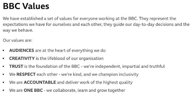
Our mission is "to act in the public interest, serving all audiences through the provision of impartial, high-quality and distinctive output and services which inform, educate and entertain".
1. To provide impartial news and information to help people understand and engage with the world around them
2. To support learning for people of all ages
3. To show the most creative, highest quality and distinctive output and services
4. To reflect, represent and serve the diverse communities of all of the United Kingdom’s nations and regions and, in doing so, support the creative economy across the United Kingdom
5. To reflect the United Kingdom, its culture and values to the world


RESEARCH:
ReplyDeleteSome research, one analysis missing
TA PROFILE:
Basic but good
PLANNING:
A good start - have you designed your masthead yet??
I'd like to see more about how you're going to target teens specifically.